Overlooked to Opportunity: Branding a Bayfront Community in Weeks
Overlooked to Opportunity: Branding a Bayfront Community in Weeks
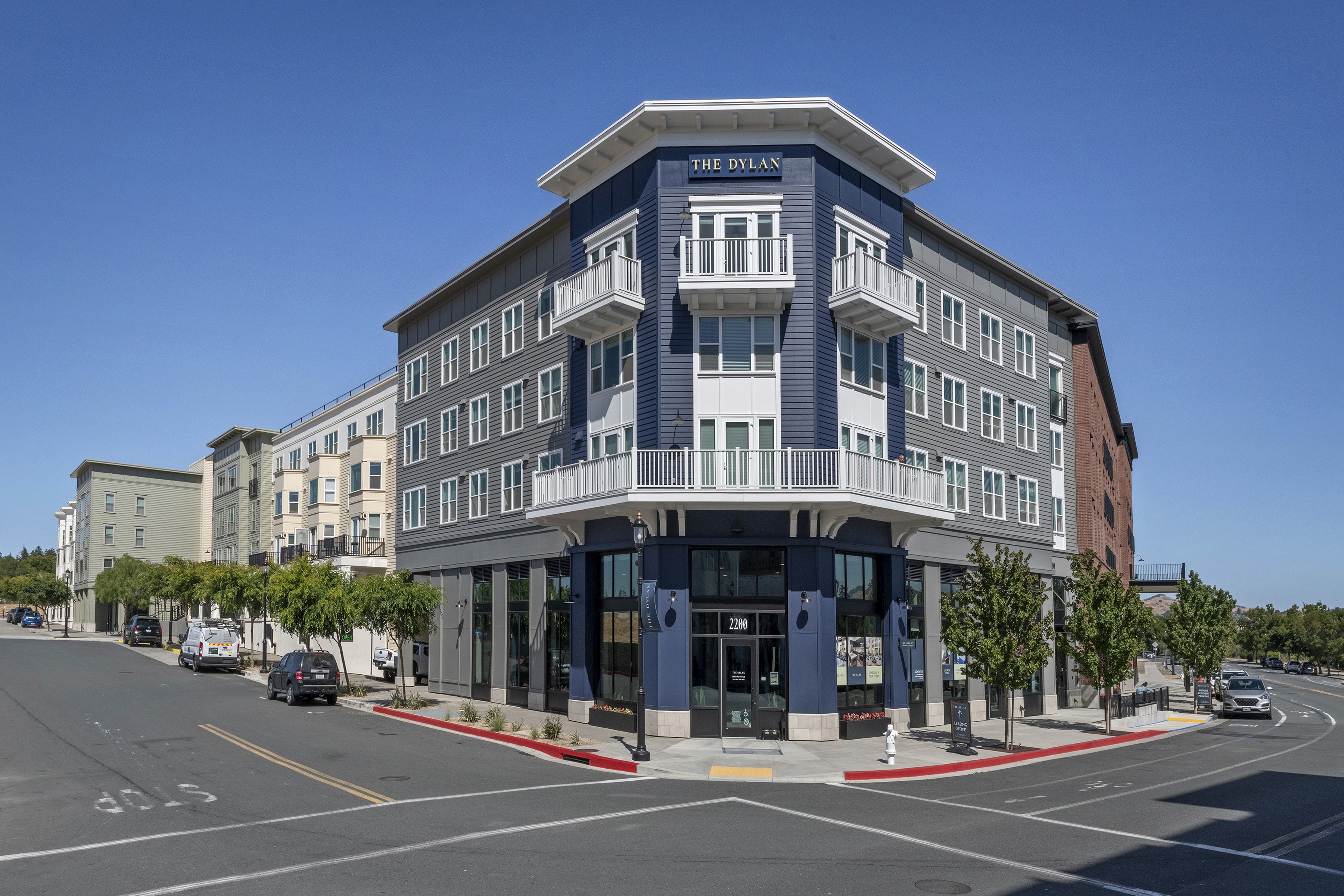
The Dylan required a complete rebrand under an exceptionally compressed timeline. Originally operating under a different identity and apartment management company, the property needed to quickly reposition itself within a competitive Bay Area market while renovations were already underway. With my director on maternity leave, I assumed ownership of the branding process, rapidly developing multiple identity directions before collaborating with executive leadership to establish a new creative vision.
The Dylan required a complete rebrand under an exceptionally compressed timeline. Originally operating under a different identity and apartment management company, the property needed to quickly reposition itself within a competitive Bay Area market while renovations were already underway. With my director on maternity leave, I assumed ownership of the branding process, rapidly developing multiple identity directions before collaborating with executive leadership to establish a new creative vision.
Client
Lyon Living & Ledcor
Client
Lyon Living & Ledcor
Project Type:
Branding • Graphics • Signage
Project Type:
Branding • Graphics • Signage
RELEASE
2023
RELEASE
2023
Credit
S. Mckenna, Director | T. Kretzmann, SVP
Credit
S. Mckenna, Director | T. Kretzmann, SVP

Refined by the bay
Refined by the bay
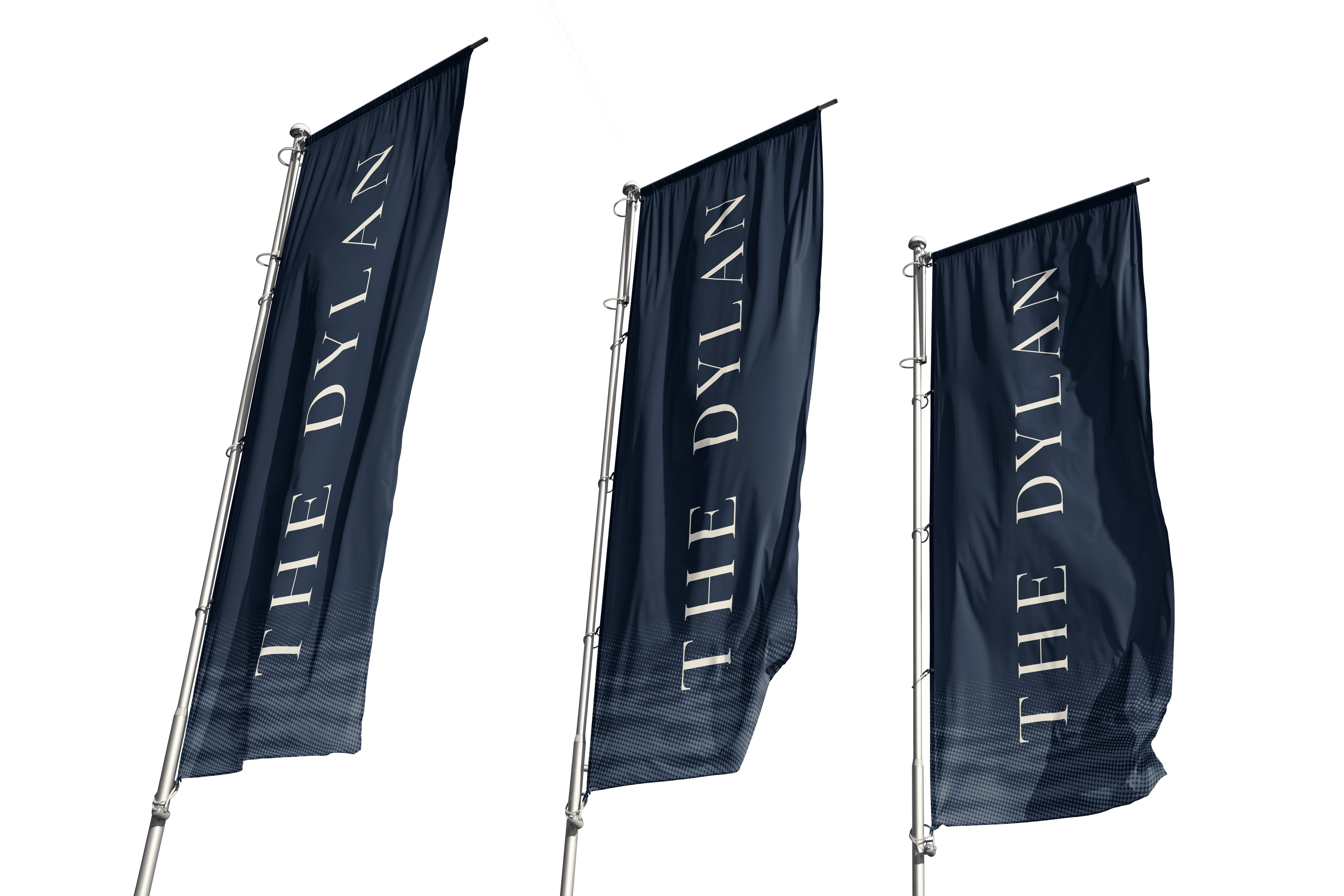
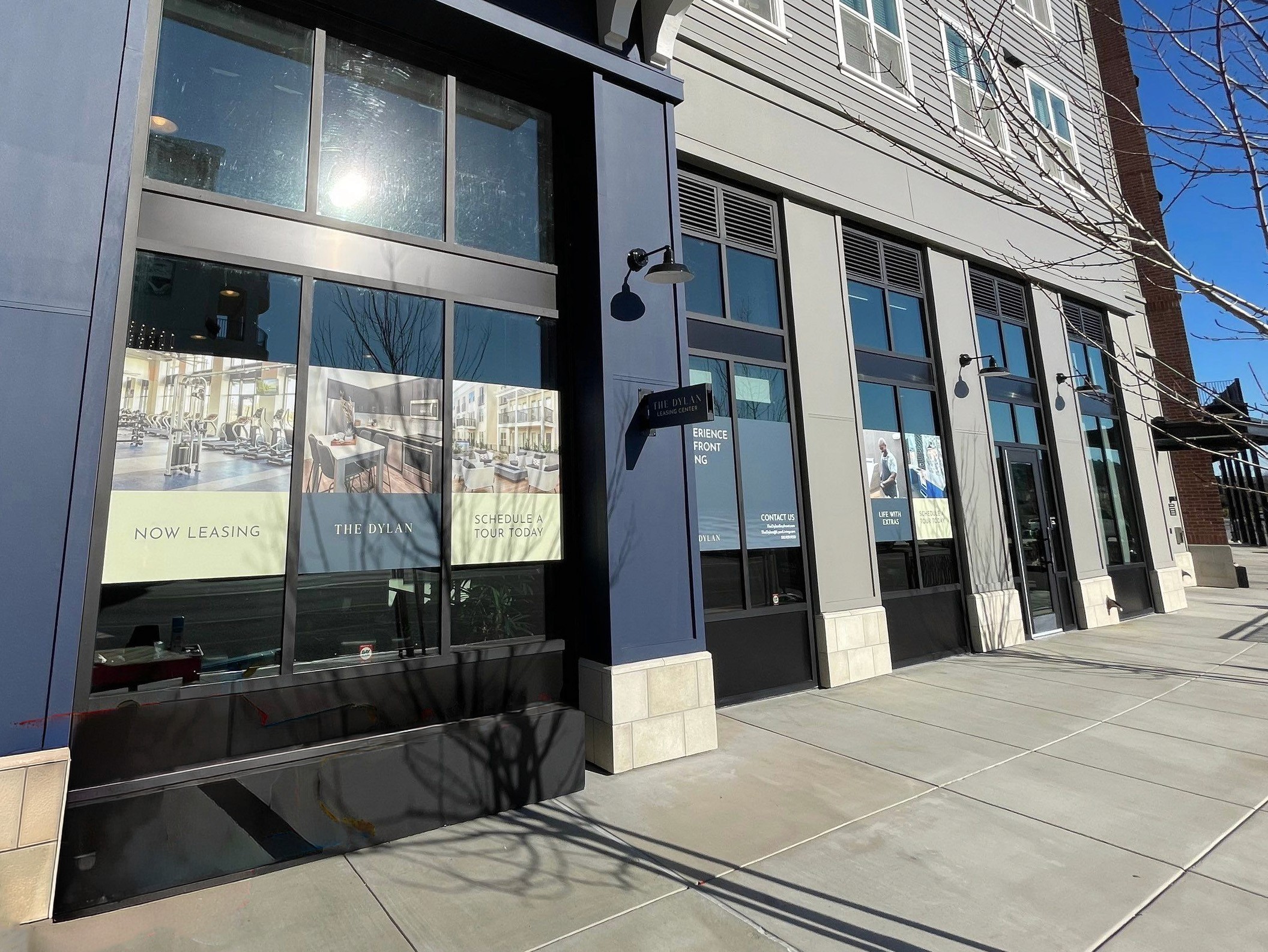
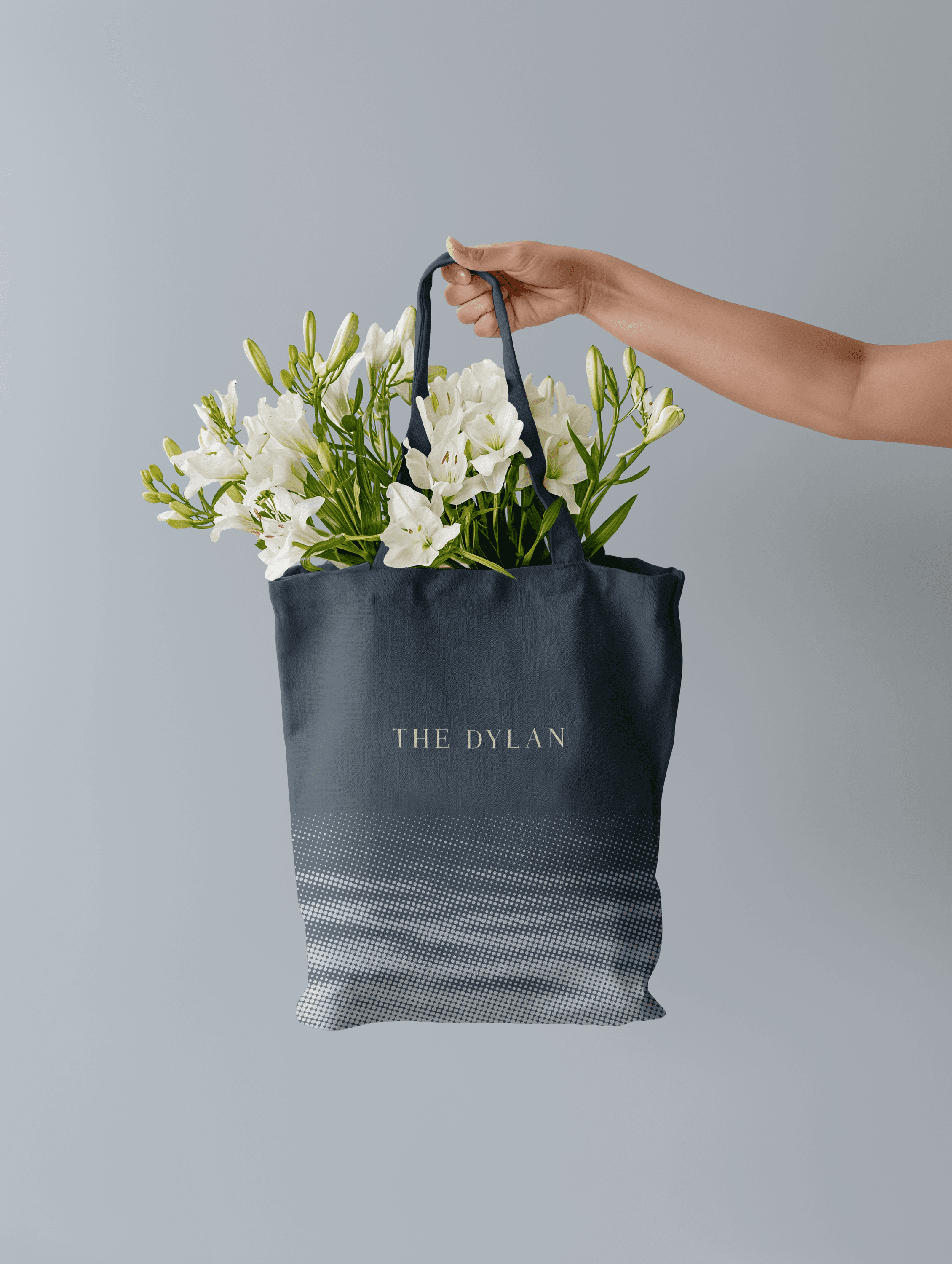
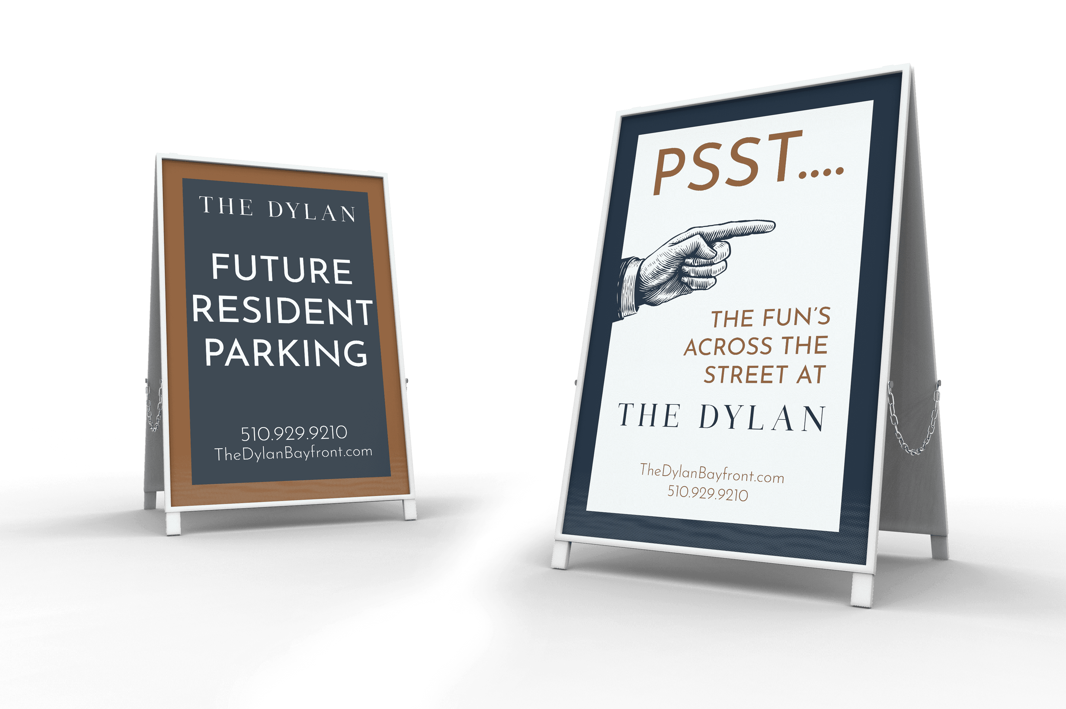
Inspired by the property's waterfront setting and the meaning behind the name Dylan ("son of the sea"), I created a flexible identity system that extended beyond the logo into environmental graphics, marketing collateral, leasing materials, and community signage. The result was a cohesive lifestyle brand that elevated market perception, supported lease-up efforts, and helped transform the property into a destination that reflected both its location and renewed sense of place.
Inspired by the property's waterfront setting and the meaning behind the name Dylan ("son of the sea"), I created a flexible identity system that extended beyond the logo into environmental graphics, marketing collateral, leasing materials, and community signage. The result was a cohesive lifestyle brand that elevated market perception, supported lease-up efforts, and helped transform the property into a destination that reflected both its location and renewed sense of place.